top of page

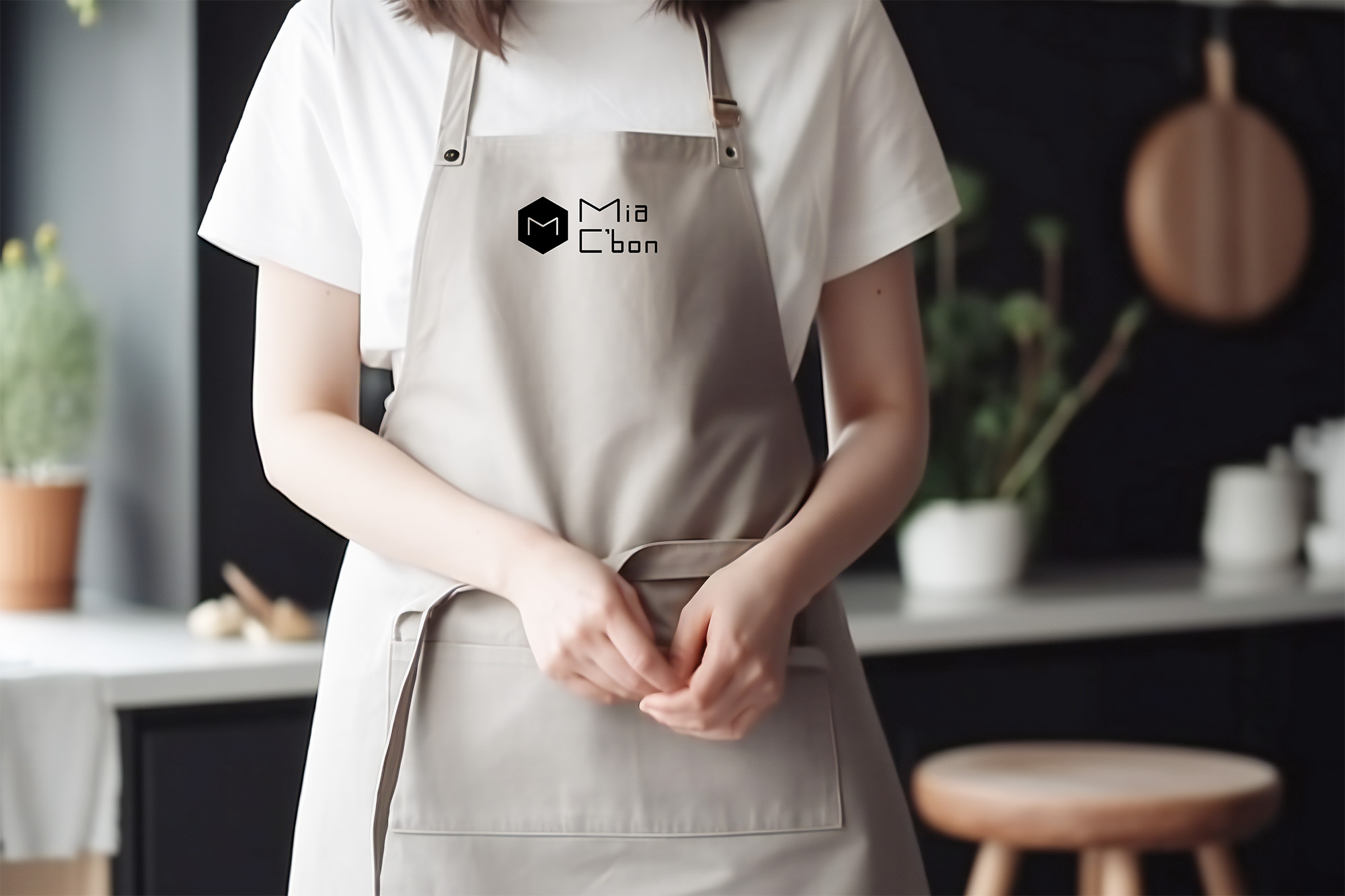
Mia C'bon

(本專案為設計練習,非官方正式。)
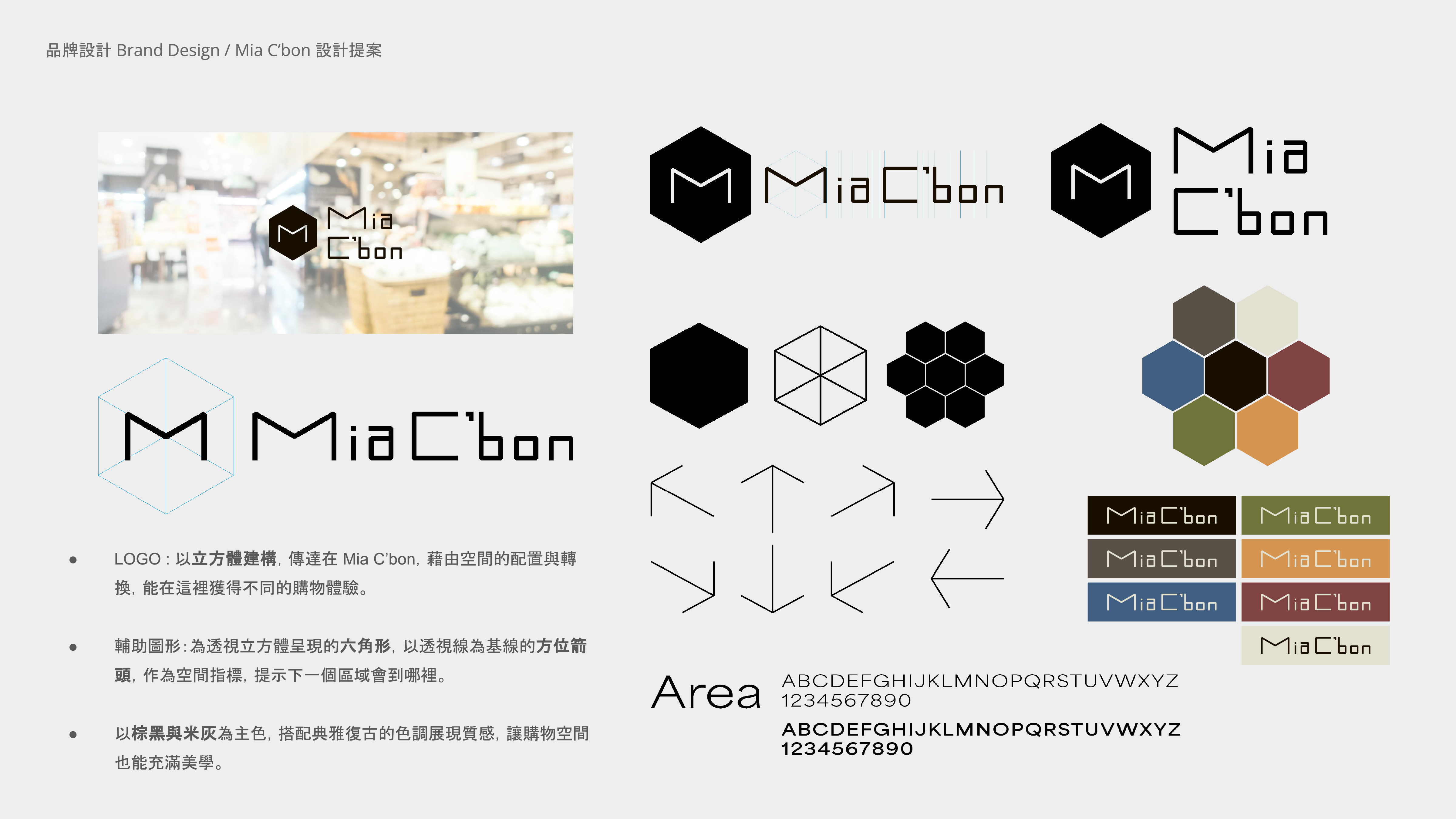
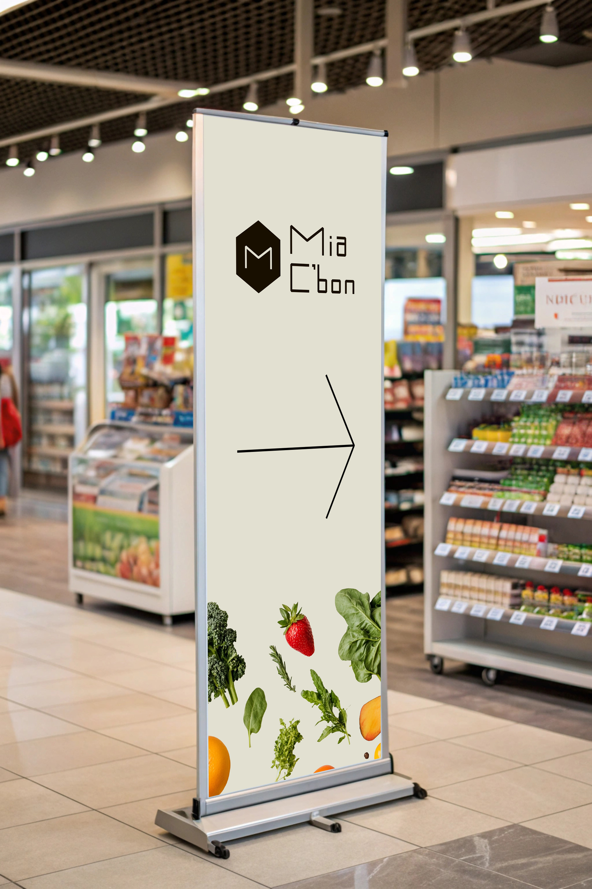
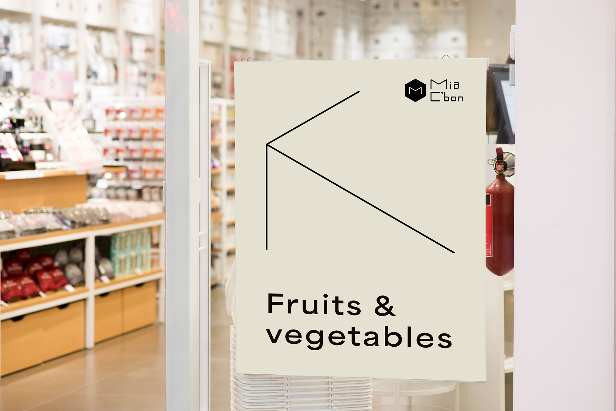
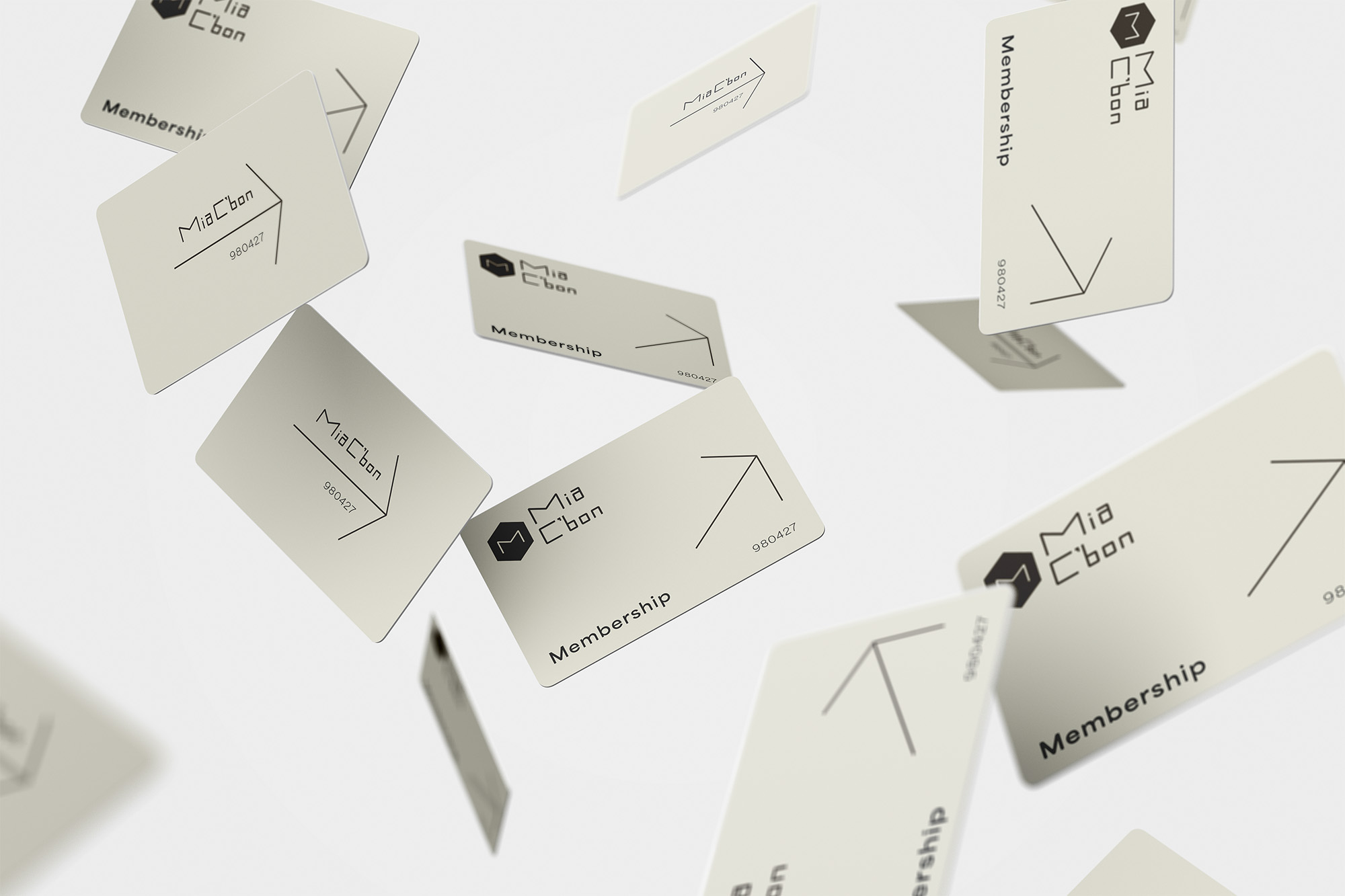
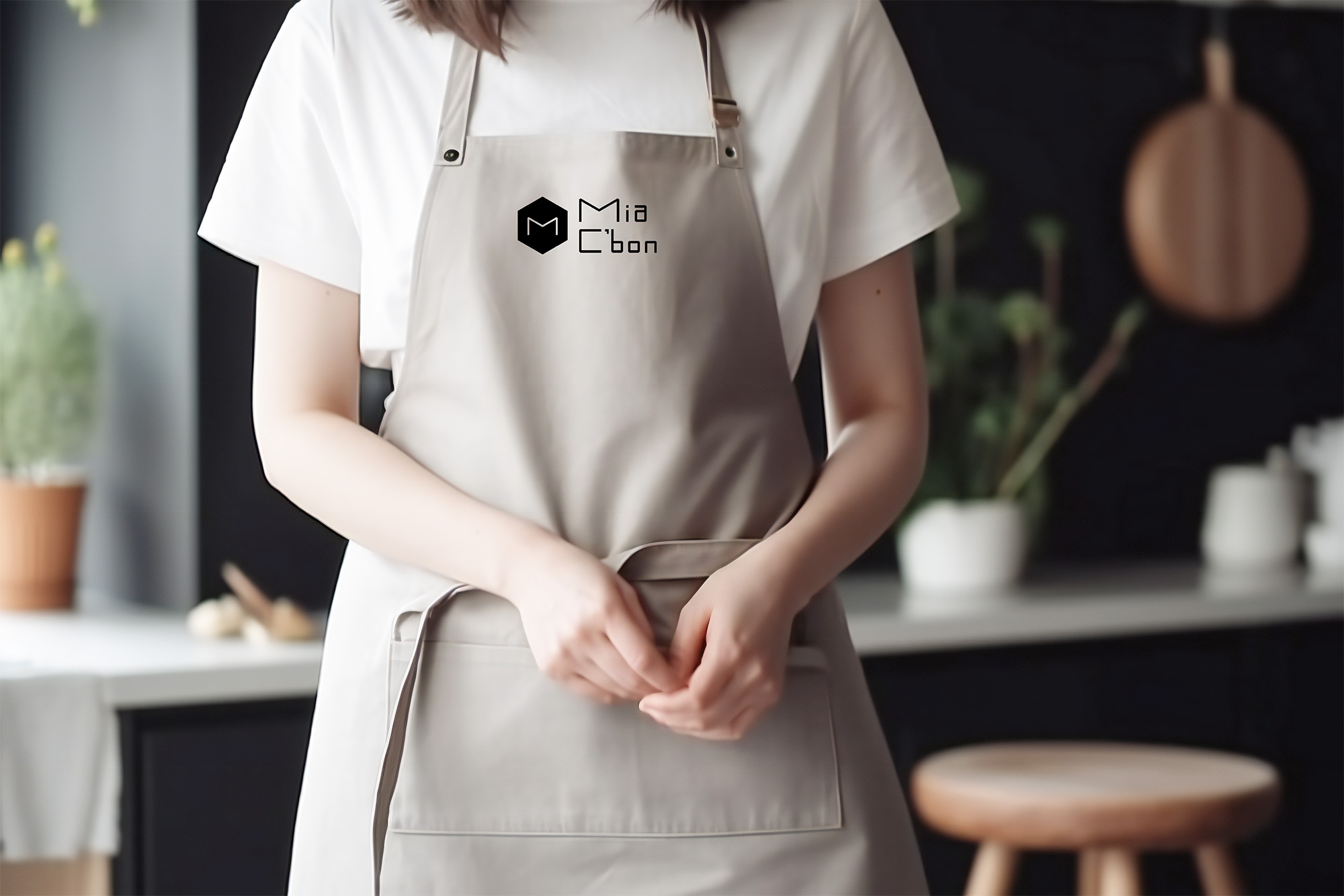
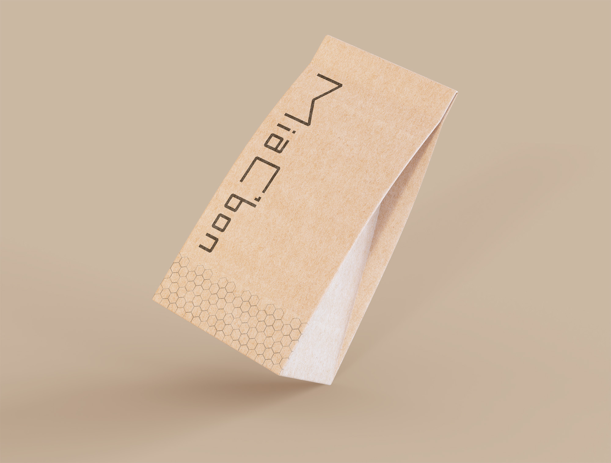
品牌核心源自於對「空間」與「體驗」的深度探索。在視覺語言上,我們將幾何立方體的架構、導引視覺的六角箭頭與溫潤的大地色調巧妙揉合,象徵在頂級超市的領域中,顧客能獲得全方位的品質探索與生活品味。
The brand's core originates from a deep exploration of "space" and "experience." In terms of visual language, we cleverly blend the structure of a geometric cube, the hexagonal arrows that guide the eye, and earth tones to symbolize that in the realm of a top-tier supermarket, customers can enjoy a high-quality spatial exploration and a refined lifestyle.
Gallery
View work details


OTHER WORKS







bottom of page